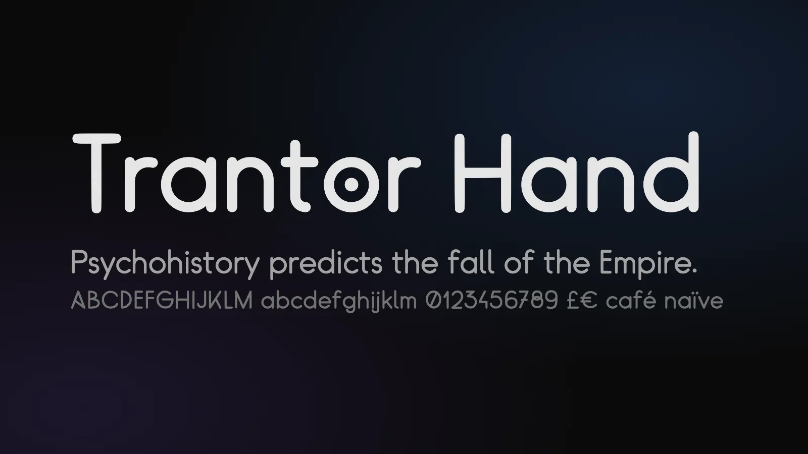
View online: desholmes.github.io/trantor-hand
Source: github.com/desholmes/trantor-hand | Licence: SIL Open Font License 1.1
👀 You’re already looking at it: the headings on this blog are now set in Trantor Hand.
The inspiration
The title sequence of Foundation, the Apple TV+ series, was created by Imaginary Forces. The lettering in its titles and credits stands out: monoline strokes with round ends, a dotted o and a crossed w. It’s simple, geometric and a little bit futuristic.
I wanted to use that style for headings. The lettering isn’t a font you can download, so I went looking.
Finding Foundation Titles Hand
Roger Sperberg had already done the hard part. In October 2021 he released Foundation Titles Hand, a font he drew from the character design in the title sequence. Version 0.85, from November 2021, comes in Regular and SemiBold and covers Basic Latin.
There was one catch: it only has capitals. The capitals, figures and punctuation are all there, but the lowercase slots hold copies of the capitals. That works for a title card, but you can’t set a sentence in it.
Extending it into Trantor Hand
Foundation Titles Hand is released under the SIL Open Font License, which lets you modify and redistribute the font. The licence also reserves the name “FoundationTitlesHand”, so a modified version needs a new name. I picked Trantor, the capital planet of the Galactic Empire in the books and the series.
Trantor Hand adds:
- a new lowercase a–z, drawn in the same rounded, single-weight style as the capitals;
- accented letters for UK English loanwords such as café, naïve, rôle, façade and señor;
- £, €, …, •, ° and a no-break space;
- rebuilt kerning: the original capital pairs, plus new lowercase pairs such as Ta, Yo and We;
- an optional stylistic set (
ss01) with the dotted o and crossed w from the title sequence.
Drawing letters with code
I didn’t draw the lowercase in a font editor. Every letter is defined in Python as a skeleton: the centre line of the stroke. The build then expands each skeleton into an outline with round caps and joins, the way the capitals are made.
Here are a few letters from build/glyphs.py:
X = 470    # x-height
ASC = 740  # ascender
R = X / 2  # bowl radius

GLYPHS = {
    "a": Glyph([bowl(), Stroke(X, X).line(X, 0)], (ROUND, STEM), top=R),
    "b": Glyph([Stroke(0, ASC).line(0, 0), bowl()], (STEM, ROUND), top=R),
    "c": Glyph([arc(R, R, R, 45, 315)], (ROUND, 25), top=R),
    "d": Glyph([bowl(), Stroke(X, ASC).line(X, 0)], (ROUND, STEM), top=R),
    # ...
}
Because the letters are centre lines, one drawing gives both weights. The build strokes each skeleton at 80 units for Regular and 101 units for SemiBold, the same stroke widths as Roger’s capitals. To change a letter, I edit its skeleton and rebuild, and both weights update together.
The build
The build script uses fontTools and skia-pathops. It:
- loads the upstream v0.85 TTFs;
- replaces the placeholder lowercase with the stroked skeletons;
- adds the accented letters and symbols;
- rebuilds the kerning, names and vertical metrics (the original metrics had no room for descenders or accented capitals);
- writes desktop TTFs, WOFF2 and WOFF webfonts, and a ready-to-use
@font-facestylesheet.
The dependencies are managed with uv, pinned to exact versions and locked with hashes. Very new releases are ignored, and only pre-built wheels are installed, so no third-party build code runs.
Using it
Copy the webfonts folder into your site and include the stylesheet:
<link rel="stylesheet" href="/fonts/trantor-hand.css" />h1, h2, h3 {
font-family: "Trantor Hand", sans-serif;
font-weight: 600; /* SemiBold */
font-feature-settings: "ss01"; /* dotted o, crossed w */
}The font only comes in weights 400 and 600, so use 600 rather than bold (700); otherwise the browser fakes a bold. The type specimen shows every character in both weights.
Credits
Thanks to Roger Sperberg for Foundation Titles Hand. The capitals, figures and punctuation are his work, and none of this would exist without them 🙌
Trantor Hand is free to use, embed and modify under the SIL Open Font License 1.1. Foundation is an Apple TV+ series, and this project isn’t affiliated with or endorsed by Apple or the series’ creators.